Winter is a dreary time of the year when everything is cold and grey. But there is a ray of light amongst the bleak weather, and that is Spring! Use the colors of this season to breathe new life into your Spring 2014 packaging
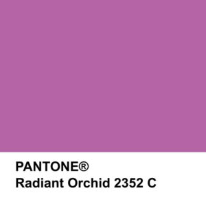
Some things you might want to include into your designs for spring 2014 are bright colors, florals, and products made from recycled materials. For a fun color, try Radiant Orchid, Pantone’s pick for 2014. This is a hue that will be used in all areas of design. This fabulous purple will “intrigue the eye and spark the imagination”. Radiant Orchid can be used as an accent color on the interiors of bags and boxes or as an embellishment to complete your look.
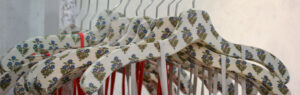
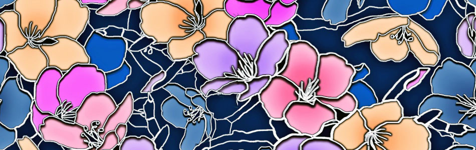
If you feel that Radiant Orchid is not quite the color for you, incorporate a timeless pattern into your designs. Spring is a time of rebirth and renewal, therefore nature themed prints are always popular. Floral patterns can add a delicate design to any packaging. They are colorful enough to be noticed, but they can be neutral to stay in style. Keeping up with fashionable colors and patterns will keep your brand from becoming tired.
With Earth Day right around the corner, you should consider multiple ways you can help reduce waste, and comply with regional bag laws. Everyone is becoming more environmentally conscious and encourage the use of reusable or recyclable bags. Use this season’s popular colors, patterns and materials to update your boxes and bags.