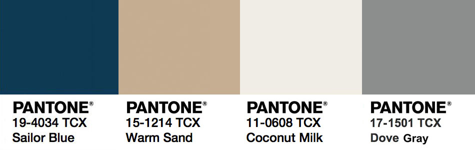
For many consumers and retailers, neutral and bold colors like gray, ivory, tan and navy are the foundation in which they start building their brand or personal style. Neutral tones like this are timeless, versatile and most importantly make up Pantone’s 2018 classic color palette.
For late 2017 into early 2018, Pantone has selected four neutral shades to be so versatile that they can be carried over into multiple seasons. To balance the mood of other trending palettes, neutral colors like Warm Sand, Dove Gray and Coconut milk offer comforting neutral shades that connect the seasons. A bold pop of Sailor Blue anchors the palette, creating a neutral feel for a trendy seasonal packaging collection.
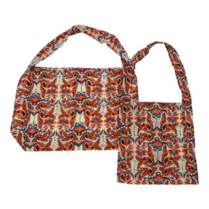
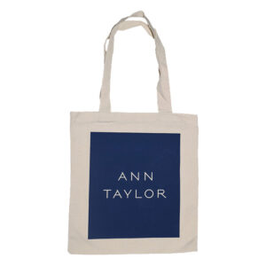
These colors can easily be incorporated into your packaging design; whether they are being used in materials, custom printing, hot stamping or to balance out selected shades from Pantone’s 2018 color trend forecast; they will be sure to catch your customer’s attention.
It’s fun to keep up with current color trends. Make your collection stand out with a combination of popular designs along with colors from the Pantone’s 2018 classic color palette. We are excited to see this selection of hues in stores, homes and finally on all types of packaging and ecommerce supplies.