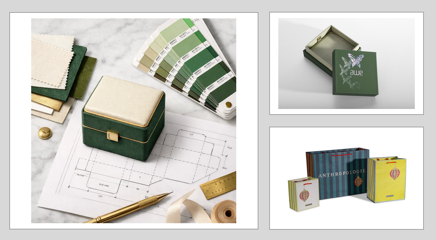
A customer picks up a product, examines the box, feels the material, and decides whether it looks worth the price. All of this can happen before they even experience the product.
Packaging plays an important role in that interaction. The right combination of color, materials, structure, typography, and finishing details can make an ordinary product feel more appealing. Poorly designed packaging can create the opposite impression, even when the product inside is exceptional.
For retailers, successful packaging aesthetics involve more than following design trends or creating attractive graphics. The goal is to communicate quality, establish a recognizable identity, and make customers feel confident about their purchase.
Knowing which packaging elements deserve the most attention can help retailers create a stronger customer experience without overspending on decorative features.
First Impressions Start With Packaging Design
Retail customers rarely evaluate every product with the same level of attention. They scan shelves, compare options, and look for visual signals that help them make decisions.
Packaging needs to communicate something meaningful during those first few moments.
A cosmetics brand might use clean typography, coordinated colors, and carefully arranged product information to create a sophisticated appearance. A specialty candle retailer might choose a textured box with subtle metallic accents to reinforce a premium positioning.
The objective isn’t necessarily to create the loudest or most elaborate packaging. It’s to help customers recognize the product, understand its appeal, and associate it with the right brand experience.
For retailers competing in crowded categories, custom printed retail packaging provides opportunities to differentiate products through recognizable visual elements and thoughtful construction.
A successful first impression usually depends on three characteristics:
- Clarity: Customers can quickly identify the brand and product.
- Visual Appeal: Colors, graphics, and materials create an attractive presentation.
- Consistency: Packaging reflects the quality and personality customers expect from the brand.
Retailers should evaluate their packaging from the customer’s perspective. If the product were sitting beside ten competitors, would shoppers recognize its purpose and remember its appearance?
Color Psychology and Brand Recognition
Color is one of the most noticeable elements of packaging design. It can help establish personality, reinforce product positioning, and create consistency across an entire collection.
Neutral palettes, including cream, beige, black, and white, are frequently associated with understated elegance. Bright colors can communicate energy and playfulness, while deeper shades may create a dramatic or sophisticated impression.
These associations aren’t universal. Customer preferences, cultural expectations, and the products being sold all influence how colors are interpreted.
Retailers should begin with their existing brand identity rather than selecting colors simply because they’re fashionable.
Consider how a color scheme will appear across different packaging formats. A shade that looks attractive on a rigid gift box should also work on shopping bags, tissue paper, and smaller product cartons.
Contrast also deserves attention. Light typography against a pale background may look appealing in a digital mockup but become difficult to read under retail lighting.
A coordinated visual system creates recognition without requiring every package to look identical.
Seasonal collections can introduce new colors while preserving familiar logos, typography, and signature design elements. Brands planning updates can also explore packaging color palettes and combinations for additional design inspiration.
Materials and Texture Influence Perceived Quality
Packaging is more than something customers see. They touch, lift, open, and carry it.
These physical interactions can influence how customers evaluate a product’s quality.
A sturdy rigid box with a smooth finish creates a different experience from a lightweight folding carton. A textured paper shopping bag feels different from one with a glossy surface. Fabric pouches introduce another tactile element that can complement jewelry, accessories, and specialty gifts.
Neither material is automatically better. The right choice depends on the product, retail environment, pricing, and customer expectations.
For example, a luxury fragrance collection might benefit from substantial packaging that provides a secure fit and a refined presentation. A small apparel accessory may only need a simple, well-designed folding carton.
Material selection should account for several factors:
- Thickness and Strength: Packaging should maintain its intended shape during handling.
- Surface Texture: Smooth, textured, matte, and coated surfaces create different physical impressions.
- Product Compatibility: Materials should suit the product’s dimensions, weight, and protection requirements.
- Visual Consistency: The selected material should support the brand’s established design language.
Premium presentation doesn’t always require expensive materials. A carefully constructed box with balanced proportions and attractive printing can look more polished than a costly package with an unfocused design.
Typography and Graphics Should Communicate Clearly
Typography is often overlooked during packaging development, yet it affects both appearance and usability.
Fonts for product names, logos, and supporting descriptions should reflect the brand while staying easy to read.
Elegant serif fonts may complement a premium cosmetics collection, while contemporary sans-serif typography can give a product a clean, modern appearance.
Problems arise when retailers combine too many fonts, use excessively small lettering, or crowd the packaging with decorative graphics.
Effective packaging establishes a visual hierarchy. The most important information receives the greatest emphasis, while supporting details remain accessible without competing for attention.
Retailers should prioritize the brand name, product identification, and essential information before introducing additional decorative elements.
Negative space can be especially effective. Leaving room around a logo or product name creates a more organized look and helps key design elements stand out.
A strong layout should also work across multiple packaging sizes. If a design becomes unreadable on the smallest product in a collection, the typography system needs adjustment.
Premium Finishes Can Make Packaging More Memorable
Specialty finishes provide opportunities to add texture, dimension, and visual contrast without completely redesigning a package.
Used strategically, these treatments can highlight key branding elements and strengthen a product’s perceived value.
Several popular options include:
- Foil Stamping: Metallic or decorative foil accents can emphasize logos, patterns, and selected design elements.
- Embossing: Raised details create a tactile surface that customers can see and feel.
- Spot UV: Selective gloss creates contrast against surrounding matte surfaces.
- Matte and Gloss Laminations: Different coatings can change the overall appearance and feel of printed packaging.
The most important consideration is restraint.
A black rigid box featuring a small foil-stamped logo may communicate luxury more effectively than packaging covered in metallic graphics, raised patterns, and multiple competing finishes.
Retailers should identify the specific feature they want to emphasize before choosing a specialty treatment.
For example, foil stamping can draw attention to a brand mark, while embossing may better highlight a distinctive pattern.
Packaging Structure and Product Fit Are Part of the Design
Attractive graphics cannot compensate for poorly constructed packaging.
A box that’s too large for its contents can make a product appear smaller or less carefully presented. Packaging that’s too tight may make it hard to open or put unnecessary pressure on delicate items.
The best packaging considers the product’s dimensions, shape, weight, and intended retail presentation from the beginning.
A candle box, for example, should accommodate the vessel securely while leaving enough room for practical insertion and removal. Jewelry packaging may benefit from fitted inserts that position each piece attractively.
Structure also influences how customers interact with a package.
Magnetic closures, lift-off lids, folding cartons, sleeves, and windowed boxes all create different experiences. Each option should be evaluated according to its intended purpose rather than visual appeal alone.
For retailers selling products that need extra support, custom packaging inserts can improve product positioning and create a more organized presentation.
A well-designed structure should feel natural to open, display the product attractively, and provide the protection required during handling.
The Unboxing Experience Extends the Customer Relationship
The packaging experience doesn’t end when a customer completes a purchase.
Opening a product creates another opportunity for the retailer to reinforce its brand identity and make the purchase feel worthwhile.
Thoughtful interior presentation can turn a basic box into a coordinated experience.
Branded tissue paper, fitted inserts, ribbons, printed interiors, and neatly arranged products can contribute to a memorable reveal.
These details matter most for beauty products, jewelry, apparel, candles, and gift-oriented collections.
Consider two retailers selling similar accessories. One places the product inside a plain shipping box with minimal organization. The other uses a fitted box, branded tissue paper, and a coordinated presentation.
The second approach may create a stronger impression of care and attention, even if the accessories themselves are comparable.
The experience should still remain practical. Packaging that requires too much effort to open can frustrate customers, no matter how attractive it looks.
Retailers can use branded tissue paper packaging to coordinate the interior presentation with the outside of the package.
An appealing unboxing experience may also encourage customers to photograph or share their purchases online, creating opportunities for additional brand exposure.
Consistency Across Retail, Ecommerce, and Seasonal Collections
Modern retailers often interact with customers through multiple purchasing channels.
A shopper might first encounter a product on social media, examine it in a physical store, and eventually order it online.
Packaging should create a recognizable experience across those interactions.
A brand’s signature colors, typography, logos, and finishing details should remain consistent even when packaging structures change.
For example, an apparel retailer may use premium paper shopping bags in stores and protective mailers for ecommerce orders. The formats serve different functions, but both can feature coordinated branding.
Maintaining this consistency becomes increasingly important as retailers introduce additional products and seasonal collections.
Developing a flexible packaging system can simplify future design decisions. Establishing approved colors, font combinations, logo placements, and materials allows new packaging to complement existing products.
Seasonal packaging can introduce limited-edition graphics or decorative accents without losing the brand’s familiar appearance.
Retailers should also consider how packaging looks in product photography. Materials and finishes that appear attractive under store lighting may photograph differently, particularly when reflective surfaces are involved.
Where Retailers Should Invest Their Packaging Budget First
Not every packaging enhancement provides the same value.
Retailers working with limited budgets should prioritize the elements that support product quality, customer understanding, and a consistent brand experience.
A practical investment order begins with the fundamentals.
- Structure and Product Protection
Choose packaging that fits the product correctly, maintains its shape, and supports safe handling. Decorative improvements offer little value if the product arrives damaged or looks poorly presented.
- Color and Visual Hierarchy
Create a recognizable appearance with coordinated colors, readable typography, and clearly organized branding. These elements shape how customers experience packaging before they even touch it.
- Materials and Surface Texture
Select materials appropriate for the product category and price point. A more substantial material may improve presentation, but it should also serve a practical purpose.
- Consistent Branding
Ensure logos, graphics, and messaging follow the same visual system across packaging formats. Consistency helps customers connect individual products to the larger brand.
- Decorative Finishes
Introduce foil stamping, embossing, or specialty coatings where they make a noticeable difference. Reserve these treatments for the elements that deserve emphasis.
- Interior Presentation
Consider tissue paper, inserts, ribbons, or printed interior details when they complement the customer experience.
The ideal order will vary. A jewelry retailer may place greater importance on protective inserts, while a boutique apparel company may prioritize premium shopping bags.
The strongest investment decisions are based on the product and customer, not a checklist of decorative features.
Common Packaging Design Mistakes Retailers Should Avoid
Packaging can become less effective when retailers focus too heavily on appearance without considering how customers actually interact with it.
Several common mistakes deserve attention.
- Overcomplicated Graphics: Too many design elements compete for attention, making important information hard to identify.
- Inconsistent Branding: Different packaging formats use unrelated colors, fonts, or logos, creating a fragmented customer experience.
- Poor Product Fit: Oversized or improperly constructed packaging makes products appear less carefully presented.
- Excessive Decorative Finishes: Multiple premium treatments increase complexity without necessarily improving visual appeal.
- Unreadable Typography: Small text or insufficient contrast makes packaging less practical.
- Ignoring Ecommerce Requirements: Attractive retail packaging may need extra protection when products ship directly to customers.
- Skipping Physical Samples: Digital mockups don’t fully communicate material texture, structural performance, or the appearance of specialty finishes.
Retailers should evaluate packaging samples under realistic conditions before committing to larger production quantities.
This includes testing how packaging looks on shelves, how comfortably it opens, and whether the materials support the intended customer experience.
Create High-Impact Retail Packaging With Prime Line Packaging
Great packaging combines attractive design with practical construction and thoughtful product presentation.
Color, texture, typography, materials, and specialty finishes all contribute to the customer’s experience, but they work best when they support a cohesive brand identity.
Retailers don’t need the most elaborate packaging to make an impression. They need packaging that reflects product quality and gives customers a reason to remember the brand.
At Prime Line Packaging, we help businesses explore packaging options that balance appearance, functionality, and brand presentation. From custom boxes and shopping bags to specialty finishes and coordinated accessories, our team can help you develop packaging that complements your products.
Explore our custom packaging solutions and contact Prime Line Packaging to discuss your next retail packaging project.
Frequently Asked Questions About Packaging Aesthetics
What Are Packaging Aesthetics?
Packaging aesthetics refer to the visual and tactile characteristics that influence how customers perceive a product’s presentation. These include color, typography, graphics, materials, texture, shape, and finishing details. Effective aesthetics create a cohesive appearance that reflects the product and brand. They should also complement practical requirements such as protection, handling, and accessibility.
How Do Packaging Aesthetics Influence Customer Buying Decisions?
Customers frequently use packaging as one of several signals when evaluating unfamiliar products. Attractive presentation can help communicate quality, product positioning, and brand personality. Consistent branding may also make products easier to recognize during future shopping experiences. Packaging alone doesn’t guarantee a sale, but it can strengthen the impression customers form before purchasing.
What Packaging Design Elements Have the Biggest Impact on Retail Customers?
Color, visual hierarchy, product fit, material quality, and recognizable branding are valuable starting points. These elements help customers identify products and evaluate their presentation. Specialty finishes and decorative accessories can add extra appeal once the fundamentals are in place. The most effective combination depends on the product category and target customer.
How Can Retailers Make Their Packaging Look More Premium?
Retailers can create a more premium appearance through thoughtful material selection, balanced typography, coordinated colors, and precise construction. Matte finishes, subtle embossing, and selective foil stamping may add sophistication. Well-fitted inserts and organized interior presentation can further improve the experience. A restrained design often communicates quality more effectively than excessive decoration.
What Colors Work Best for Retail Packaging?
The best packaging colors depend on the brand’s identity, product category, and customer expectations. Neutral palettes can create an understated appearance, while brighter colors may communicate energy or creativity. Retailers should prioritize consistency and readability over trends. Testing color combinations under realistic lighting can help identify potential problems before production.
Is Minimalist Packaging Better Than Elaborate Packaging?
Neither approach is universally better. Minimalist packaging can communicate clarity, sophistication, and confidence, while elaborate packaging may suit decorative gifts or products intended to feel expressive. The most appropriate approach depends on the retailer’s positioning and audience. Effective designs create visual interest while keeping the product and brand easy to understand.
How Can Small Retailers Improve Packaging Without Significantly Increasing Costs?
Small retailers can begin with consistent colors, clear typography, appropriate packaging dimensions, and better product organization. Improving logo placement or simplifying unnecessary graphics can make a noticeable difference without requiring expensive finishes. Standardizing packaging components across several products can also simplify purchasing and inventory management. Selective enhancements are usually more practical than redesigning every packaging element at once.
What Is the Best Way to Create Consistent Packaging Across Multiple Products?
Start with a packaging design system that defines approved colors, typography, logo treatments, materials, and graphic layouts. Apply those elements across boxes, bags, inserts, and other components while adjusting dimensions and structure for individual products. Seasonal collections can introduce complementary design elements without replacing the core brand identity. Consistency helps retailers present a coordinated collection across physical stores and ecommerce channels.