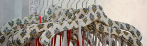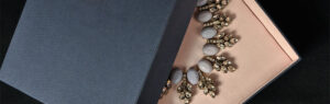
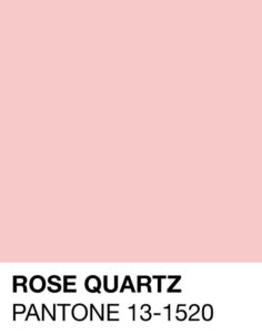
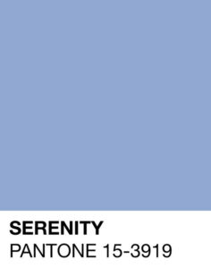
For the first time, Pantone has blended two swatches for colors of the year, Serenity and Rose Quartz. These two soft hues will be prominent throughout 2016’s fashion, home décor, design, makeup, packaging and e-commerce fields.
Joined together, Rose Quartz and Serenity demonstrate an inherent balance between a warmer rose tone with a cooler tranquil blue. The reflecting connection of these colors creates a sense of order and peace to our modern day stresses.
Rose Quartz is a warm embracing tone that conveys compassion and a sense of composure. It is very versatile and appealing in all finishes such as matte, metallic and glossy. Rose Quartz can also be easily joined with other mid tones like greens, purples, rich browns and of course yellow and pink. Add in modern metallic details for some sparkle.
Serenity is the cooler hue of the two. It has a weightless and airy feel like the clouds floating above us. This swatch brings us feelings of relaxation and stress relief, even in turbulent times. Like Rose Quartz, Serenity can be paired with deep greens and purples as well as rich brown to create an attractive palate for this upcoming year. Combine the colors of the year on your next packaging project for a fashion forward and tranquil look.
For more information visit Pantone’s color guide to find out how you can factor these colors of the year into your packaging and beyond.