
Since 1999, the Pantone Color Institute influences product development in multiple fields with their suggestions of the most popular colors of the time to use in e-commerce and in retail packaging. Pantone decides each color of the year through a long and thoughtful process. This method takes lifestyle and industry trends into consideration. Each color represents the new year. Most importantly, naming the new color of the year is also a main factor. According to Pantone’s Vice President, “The name really has to resonate with the message that we want to get across.”
It seems as though shades of blue have been a popular choice for Pantone in the past. The first ever color of the year was 1999’s Cerulean. Much like classic blue, Pantone chose Cerulean to represent a new decade. Offering a calming visual to the worries of a new millennium. Another shade of blue, Aqua sky then followed in 2003. Next, Blue Turquoise in 2005, along with Blue Iris in 2008. Finally, Pantone chose Serenity as a nice contrast to Rose Quartz in 2016. Similar to 2020’s new color, Serenity (and Rose Quartz) provide a sense of order and peace to our modern-day stresses. 2016 was also the first time Pantone chose two swatches as colors of the year.
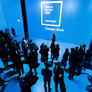
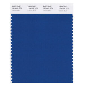
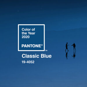
Pantone’s color of the year is one of the most influential indicators of upcoming trends for starting a new year. This deep shade of blue will prominently be seen in the new year throughout fashion, home décor, design, makeup trends, and especially packaging. Late in 2019, Pantone finally announced the new color of the year for 2020: Classic Blue. This deep hue is suggestive of the sky at dusk. Not quite a royal blue, but not exactly as dark as midnight blue, classic blue is that perfect in between shade that can fit into any style and trend.
About Classic Blue
Pantone’s executive director describes classic blue as “We are living in a time that requires trust and faith. It is this kind of constancy and confidence that is expressed by PANTONE 10-4052 Classic Blue (PANTONE 10-4052 TCX cross references to PANTONE 2154 C) . A solid and dependable blue hue we can always rely on. Instilling a deep resonance, Classic Blue provides an anchoring foundation. Classic blue is a boundless blue evocative of the vast and infinite evening sky. This hue encourages us to look beyond the obvious to expand our thinking; challenging us to think more deeply, increase our perspective and open the flow of communication.”
As we head into a new decade, Pantone’s executive director also adds that “we want to challenge ourselves to find inspiration from new sources that not only evolve our color of the year platform, but also help our global audiences achieve richer and more rewarding color experiences. The desire, combining with the emotional properties of classic blue motivate us to expand beyond the visual. Bringing the 2020 Pantone Color of the Year to life through a multi-sensory experience.”
This year’s classic blue offers a sense of calming and peace to the viewer. As technology continues to rapidly evolve faster than we can comprehend, this classic shade of blue is easy to gravitate towards; given its non-aggressive, easily relatable hue. Classic blue lends itself to a relaxing interaction, associating itself with the return of another day, and a fresh start. All who view this universal favorite comfortably embrace it.
Classic Blue and Current Trends
For companies who are all about staying on trend in the new year, we see pops of classic blue everywhere from fashion, to home, and the workplace. Even incorporating classic blue into new 2020 packaging collections are made easy. No matter your brand identity, there are so many trends that can easily accommodate classic blue into your company’s packaging collection.
For example, one trend that is gaining notoriety is packaging that tells a story. With the growing popularity of branded ecommerce and subscription boxes, and an influx of online shopping, there is a lack of an in-store shopping experience. Because of this, companies are branding their packaging to tell a story. Packaging that tells a story builds a connection with the customer. Classic blue is suitable for this trend due to its calming, yet stabilizing nature.
However, there are still customers who love to shop in-stores. Brands can easily include classic blue into their store atmospheres and in-store packaging. Considering classic blue can appeal to all the senses, stores can create a multi-sensory atmosphere from décor to window displays and finally to packaging using this hue.
Another popular trend that can feature classic blue as well as fit into any collection is ecologically aware packaging. In 2019, we have seen an influx of eco-friendly and Earth conscious packaging. We expect this trend to remain popular throughout 2020. Classic blue can go hand in hand with this trend considering its tranquil nature and reference to the night sky. Pantone’s new color of the year is a reminder to keep our skies and oceans beautiful.
Classic Blue Packaging
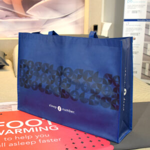
Whether your packaging is in store or strictly ecommerce, brands can effortlessly apply classic blue into their packaging collections. From season to season, consumers and retailers can appreciate this relaxing shade of blue. Adding a combination of classic blue and current trends will create something fresh for your customers and brand alike.
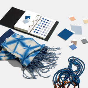
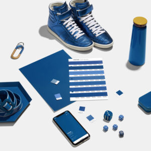
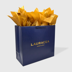
Depending on your brand’s style, classic blue can pair well with textured materials like velvet, cotton canvas, vinyl or specialty papers. With the combination of Pantone’s color of the year and different materials, your brand can create pouches, handles for shopping bags, and reusable bags, incorporating pops of blue. In addition to adding pops of blue to your packaging, custom printing this modern hue is also an option for those who are looking for a monochromatic look.
Treatments
To achieve this style, pair classic blue with spot uv. This treatment is a great option to add onto any type of shopping bag or gift box. Pairing spot uv with the new color of the year can take any packaging collection from simple to modern and trendy. Other treatments like embossing, debossing or matte or gloss laminations can provide a multi-textured and monochromatic effect. Also, pairing one-color materials like vinyl or pvc along with treatments like these will create a modern and upscale look for your updated packaging pieces.
Much like the treatments listed above, adding foil hot stamping onto your classic blue packaging can make your items stand out. The pop of metallics along with the contrast of deep blue will add a rich feel to your packaging. The foil itself will add that little bit of shine to your items, creating eye-catching pieces. Pairing classic blue with other metallics will create a sleek and sophisticated look on your materials of choice.
Classic blue is the perfect addition to any packaging collection. Considering its visually pleasing nature, it is usually the color brands naturally gravitate to. Studies show, consumers will naturally gravitate towards this shade of blue because of its calming nature in otherwise stressful times. It’s fun to keep up with current color trends and to create packaging using the new color of the year. Make your 2020 packaging collection stand out with a combination of popular designs and trends including Pantone’s color of the year: classic blue. We are excited to see this calming hue in stores, and especially on packaging.


