As summer 2015 slowly comes to an end, it’s time to look forward to the 2016 materials and trends for spring and summer. We are excited to see what will be popular to incorporate into future packaging collections.
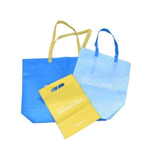
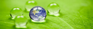
Pantone’s spring 2016 color report predicts bold and bright hues such as coral, dark teal, hazy taupe, indigo, cerulean, blue hydrangea and lemon chiffon, among other popular pastel colors like peach, champagne and sea glass green to be the go-to colors of the spring and summer 2016 seasons. Using these popular colors for 2016 materials and trends for your packaging will show your customers that you are up to date with the latest trends. Even carrying over Marsala: Pantone color of 2015 will bridge the gap between seasonal trends.
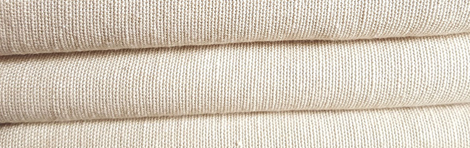
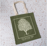
These light, trendy tones work well on boxes, pouches and bags including kraft paper and ppnw. Muslin and cotton canvas have a very airy feel to them which also works well with the summer’s color trends.
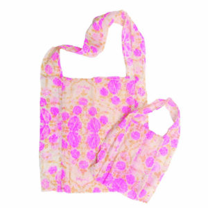
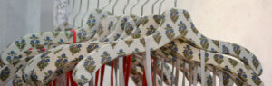
Other spring/summer trends include mixed oriental scenes and motifs with stenciling, as well as loosely drawn floral patterns. When observed, some of these patterns can appear abstract with bold diagonal designs paired with structured color blocking. The use of these color patterns reference contemporary architectural designs, which are perfect for the warmer seasons. With the combination of different tones and prints, the look of your packaging can be completely updated and fresh.